Our First Plot
In this lesson we will plot data from the iris dataset we took a peak at in the previous lesson; then we will describe this plot, and take a look at the R code responsible for producing it.
We are covering plotting early on in the course because it is a very important skill for a data scientist to have, is relatively easy to learn, and most people can make some association to it from previous learned knowledge. Moreover, it provides an excellent and engaging introduction to data science in general! Without further ado, here is the plot.
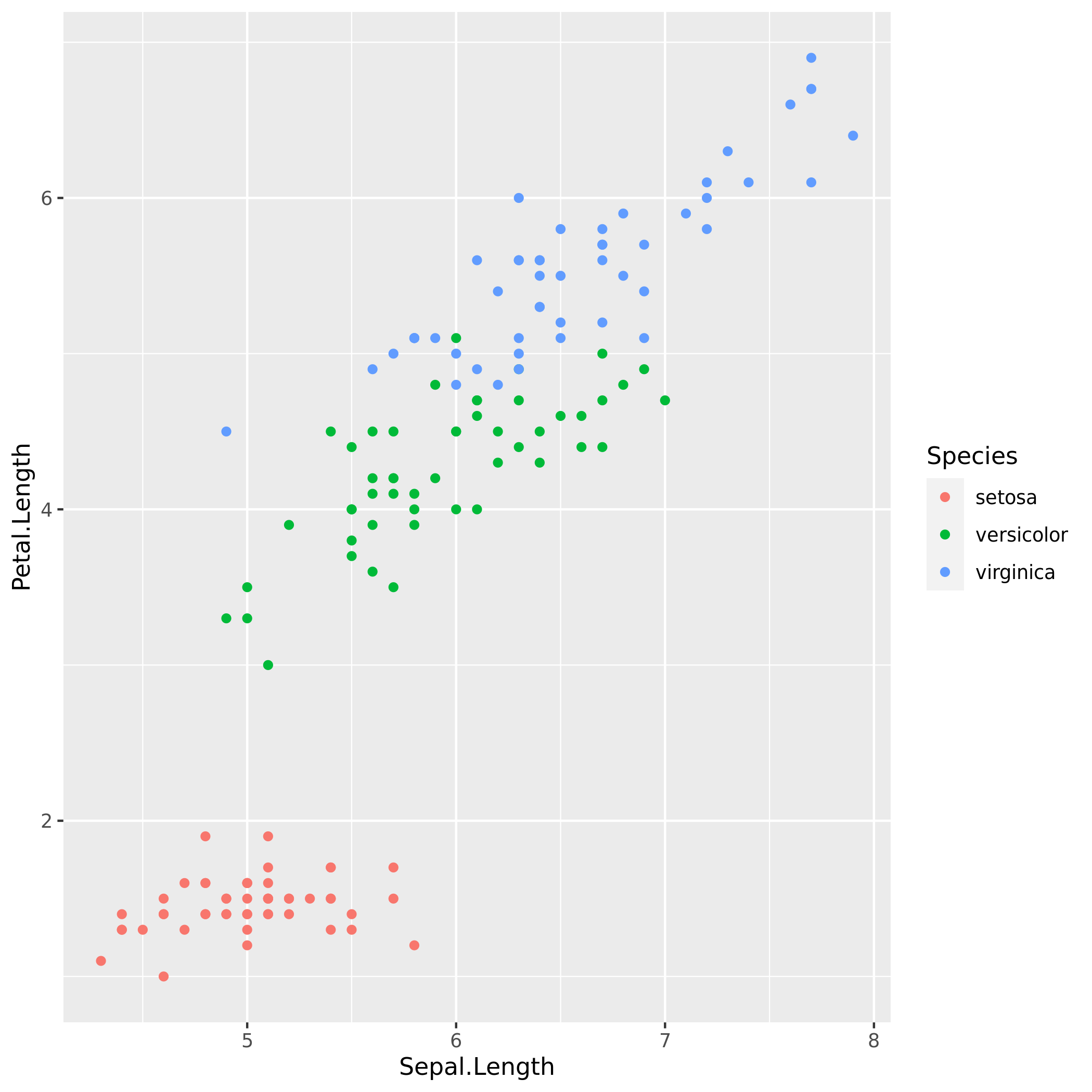
Let's examine this plot. The first thing we notice is that there are three groups of points, each group a different colour. These groups are the three different species of iris flowers in the dataset. We see that versicolor and virginica have slight overlap, but besides that there is clear separation between the three species; this is one of the first reasons why this dataset is popular in data science. Next, looking at the axes, we put Sepal.Length on the x-axis and Petal.Length on the y-axis. There are two more numeric variables, Sepal.Width and Petal.Width in this dataset, however we can only visualize two variables at a time on a 2-dimensional plot. These other variables would have worked just as well in providing a visualization.
One of the skills a data scientist needs to develop is how to make inferences. Visualizing the data in this way we may infer that iris flowers that are of the setosa variety have shorter petal length then the other two. However, we should be careful not to make any strong inferences from this plot, it is just to get an idea, and more rigorous analysis would need to be done later on to make any conclusions.
Now, let's take a peek at the code that produces this plot. There is going to be a lot of unfamiliar code in here, don't be alarmed, we will breakdown every piece of text here throughout the next four lessons.
Practice exercise
While we certainly don't expect you to understand any of the code yet, we can still get a feel for the data by looking at some of the other ways we could have made the plot.
So, to do so, let's replace the y variable Petal.Length with Sepal.Width. Feel free to make that change in the below code block.